The Challenge
Since 1994, Taste of Nature has provided a nutritious and tasty way to snack with their non-GMO verified, organic, certified gluten free, real ingredient bars.
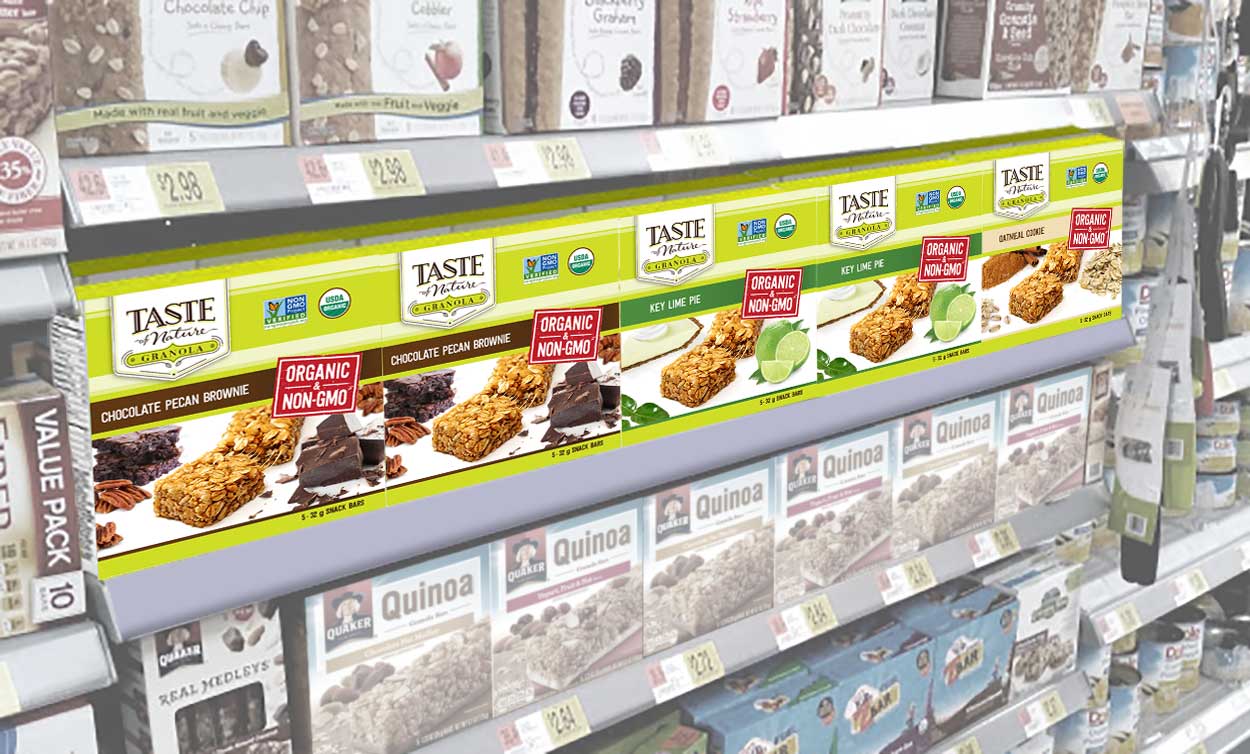
Being positioned mainly in the natural products category, they were looking at expanding in the granola bar, school lunch category with a new sub-brand called Taste of Nature Granola. This left Taste of Nature in need of a fresh look, in a bold direction.


The Solution
To lead and create a successful sub brand, we worked closely with the VP of Marketing, Brand Manger and packaging vendors of Taste of Nature.
We also engaged with their employees, and did a number of peer review exercises.
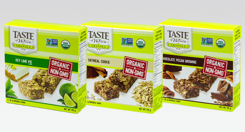
Source developed a bold new sub brand identity for the new Granola product. We wanted to counter the competitors in the category that offer little nutritional value, high levels of sugar and full of unrecognizable ingredients.
The new brand sets itself apart with a bold colour palate, simple yet effective appetite appealing photography, and yet is still unmistakably Taste of Nature. It stands alone, yet still captures the values of Taste of Nature, in communicating their mission to help make smart choices for your body (and for your taste buds, too).


