At Source Nutraceutical we pride ourselves in packaging design. Whether it is starting from scratch with a new brand or product, or taking an existing product and making it Canadian market compliant – we talk the talk and walk the walk.

Trick #1 – Keep it Simple!
The maximum time a consumer spends looking at a product is less than 4 seconds. That is all the time you have to draw them in and let them know exactly what your product is and what it does. So many products are so packed with claims and imagery that they become confusing and are often overlooked. While claims can be extremely beneficial and photography and graphics have their place as well, when they start to compete against the information the consumer needs this becomes a problem.
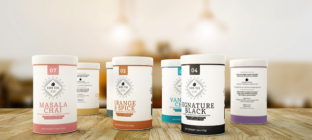
Another added benefit to this is that keeping your packaging minimalist is not only a visual breath of fresh air to the consumer, but it is also extremely on trend. Minimalist design and aesthetic has become extremely popular, and for good reason. As consumers we are constantly bombarded by visual information and more simplistic and clean design offers us a break and is quite appealing. Now minimalist DOES NOT mean easier or less design, it often means more as the elements need to work perfectly together to reflect the brand and the product.

Trick #2 – Focus on your brand
It’s been proven that people become committed to certain brands and will often remain loyal to purchasing those brands regardless of convenience or price. This is the prime reason why your brand should be the focal point of your packaging. Now, when I say ‘brand’ I don’t just mean your logo, I mean the look and emotion your packaging is built on. The colours, the textures, the fonts, the layout. All of these pieces combine to form your brand.
It is important to allow for easy variations without loosing the visual appeal and recognition of your brand. Think of it this way, let’s say that you are in the business of selling fruit juices. You have been successful with your apple variety and because of this wish to introduce an orange variety. Now, you want to ensure that the brand loyalty you have built continues with your new product. You want consumers to see your orange juice and know automatically that this a new product in a line that they know, trust and enjoy. To help ensure this it’s important to not only focus on the brand, but also to reflect back on #1 – Keep it Simple. Simple, strong elements that can easily be manipulated to create product extensions and updates.
Trick #3 – Keep it Practical
It may seem like an obvious notion, but practicality is one of the most overlooked aspects of packaging design. This should be your first step in packaging design as consumers are more likely to opt for a product that will be easier to use, carry or store.

Let’s take ketchup for example. When Heinz flipped their bottle around and began selling their ketchup in a squeeze bottle their sales skyrocketed. Why? Because consumers saw that they would no long have to beat the bottom of a glass bottle just to get the product out of the container. Practicality is key.
So the trick – before you even begin picking fonts, colours, or layout, really understand what material, shape and size your packaging should be to best suit not only your product, but the consumer and retailers needs.
Hopefully these tricks get you thinking and excited about your existing or soon to be packaging design! Remember, if you need someone to make those dreams come true for you, let us know and we’d be happy to provide you with the TREAT of a perfectly designed look.


