With Canada legalizing cannabis in October of 2018, there have been strict regulations put in place for cannabis packaging that have left many hoping for changes in the near future. The plain label packaging requirement has made it hard for the legal industry to differentiate their brand from competitors, including illegal producers.
Cannabis packaging in Canada, which must be child resistant and opaque or translucent, is limited to having a logo (with size restrictions) once on the principal display panel. Any other graphics, images and even package alterations such as embossing, die cuts or special coatings are prohibited.

These regulations make it hard for companies to carry over their branding to their cannabis packaging, creating a disconnect that may affect the consumers experience when shopping for cannabis products.
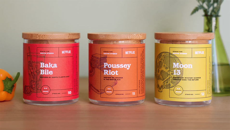
While cannabis packaging in Canada is quite boring, there is no shortage of creative packaging in other places that have legalized cannabis. As part of a pop-up event, Netflix co-created a series of cannabis strains inspired by some of its most popular shows. This series of labels uses the same layout throughout but applies different colours and illustrations to differentiate each unique strain.
With an increased consumer interest in environmentally friendly packaging, many are steering away from plastic packaging which presents the challenge of creating child resistant packaging out of different materials, such as paper or glass. Opting for a more high-quality, unique looking and/or feeling package is becoming a common choice in the packaging design process.
Similar to the Netflix strains, up and coming brand Skunk Factory also uses colour to differentiate each variety. A common theme in cannabis packaging seems to be treating it as any other type of packaging. At first glance you might not even notice these packages contain cannabis. People generally aren’t using a typical cannabis leaf graphic or the colour green, but instead are taking a more clean or sophisticated approach that still incorporates the brand personality.
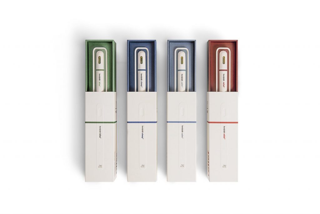
While the stigma against cannabis still exists, the packages for legal cannabis in places outside of Canada are doing a great job at marketing cannabis products to eliminate the stigma. Rather than have the look of the packaging reflect the typical “stoner” stereotype, brands are leaning towards a more sophisticated, high-quality and clean appearance to give the products a more mature, approachable look.

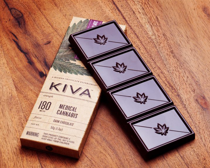
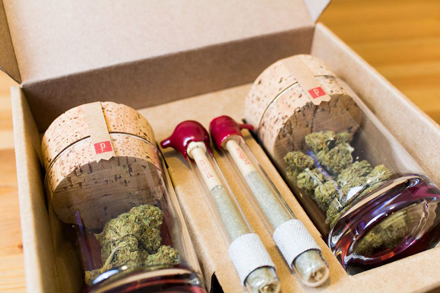
Although many package designs follow the same trends as the previous packages shown, there are many that take a different direction to give their product a more natural look. KIVA bars use a brown stock for their packaging, giving the package a much different look than packages from Skunk Factory or Netflix. Similar to KIVA bars, Potbox, a monthly subscription box, uses a similar type of material for their packaging.
Despite many cannabis packages following the same trends, they’re all very diverse in terms of how they apply colour, typography, layout and other graphics to represent their brand and product. Each product is unique in its own way and packaging is an opportunity to showcase that. Although cannabis packaging in Canada is much different, the cannabis industry is still new and growing, meaning things may not be this way forever.
Cannabis edibles are set to be legal in Canada by October 2019 and with such strict proposed regulations it will be interesting to see how much the packages differ from regular food packaging. Hopefully cannabis packaging in Canada has a more creative future ahead!