Our graphics team wouldn’t be pushing out the awesome results for our clients without Pantone Matching System(PMS). The reason that a Pantone colour should be used on packaging is to ensure the brands colours are consistent throughout–as opposed to a CMYK structure.
Every year, the talented team at PANTONE experts analyze trends in all aspects of daily life like the entertainment industry, fashion and technology to decide on the winning and fashionable colour choice for the upcoming year. Below is a synopsis of the last 20 years of hot pigmentations chosen by the authority in hues.
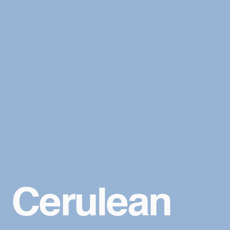
2000
Cerulean
Pantone 15-4020
The first ever Pantone Colour of the Year. This calming, sky-like blue represents the millennium and was meant to bring a sense of peace and tranquility.
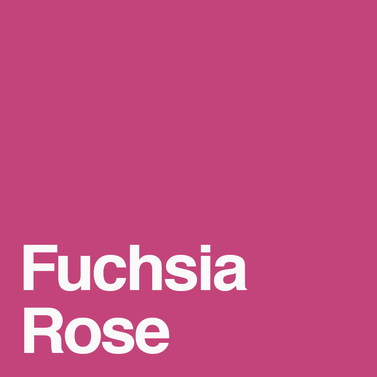
2001
Fuchsia Rose
Pantone 17-2031
Drastically different than the previous year was this exciting, saturated pink. Why did they chose it? Who knows. Maybe simply because it was so different from the previous year.
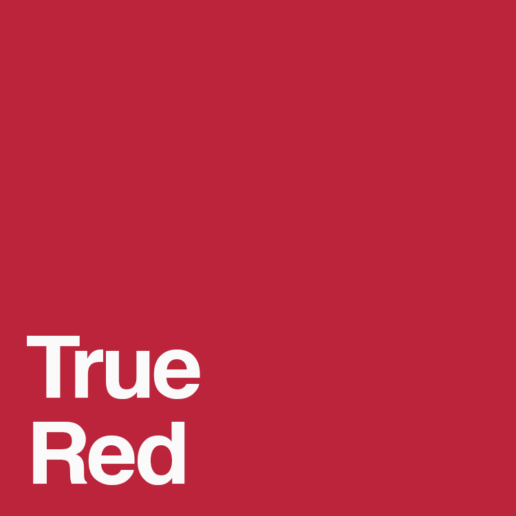
2002
True Red
Pantone 19-1664
This bold, patriotic and powerful shade was chosen as a remembrance of the attacks that occurred on 9/11. True Red represented those involved in the tragic attacks.
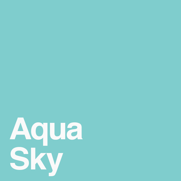
2003
Aqua Sky
Pantone 14-4811
Pantone blues seem to be Colour of the Year every few years, selected for their serene qualities. This cool blue was meant to inspire hope.
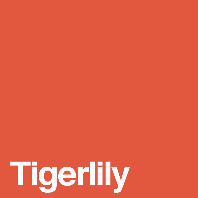
2004
Tigerlily
Pantone 17-1456
Orange was having a moment. Inspired by the tiger lily flower, this fiery orange is bold and meant to inspire creativity.
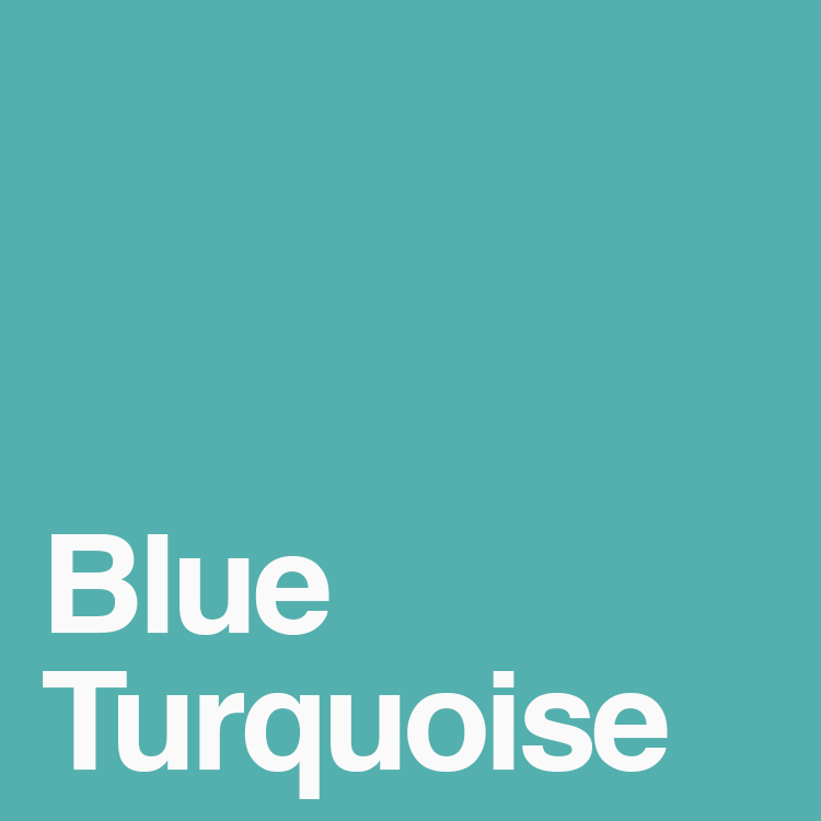
2005
Blue Turquoise
Pantone 15-5217
Another blue! Also taking inspiration from nature is this cool turquoise, the colour of the ocean on sunny day.
2006
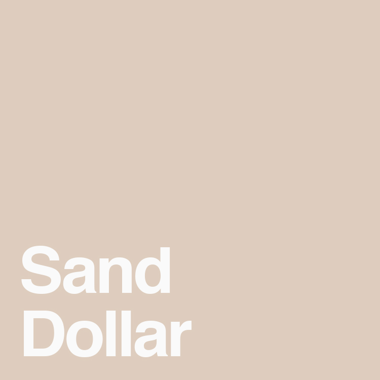
Sand Dollar
Pantone 13-1106
Yet another colour reminiscent of nature. This natural, sandy colour was chosen to represent the economic troubles at the time. This colour was very popular for fashion and interior design.
2007
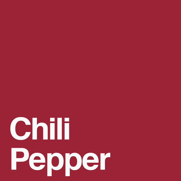
Chili Pepper
Pantone 19-1557
This deep red refused to be ignored. With its adventurous spirit, this red is bold and confident and would surely add some drama to your wardrobe or home.
2008
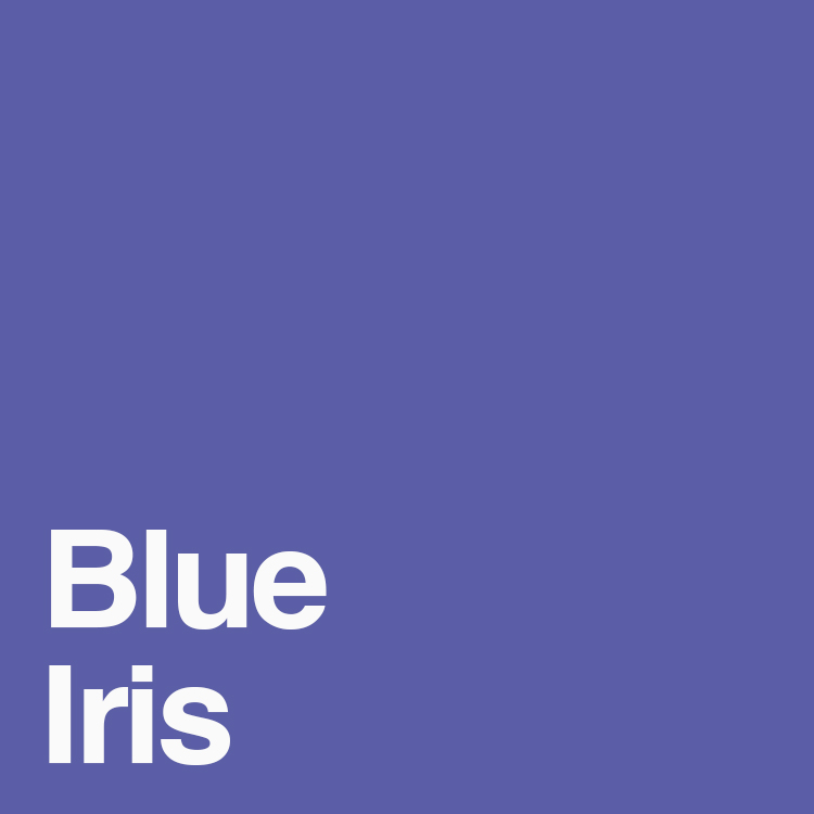
Blue Iris
Pantone 18-3943
Adding some excitement to this blue is a splash of purple. This colour was meant to inspire an anchoring and meditative state.
2009
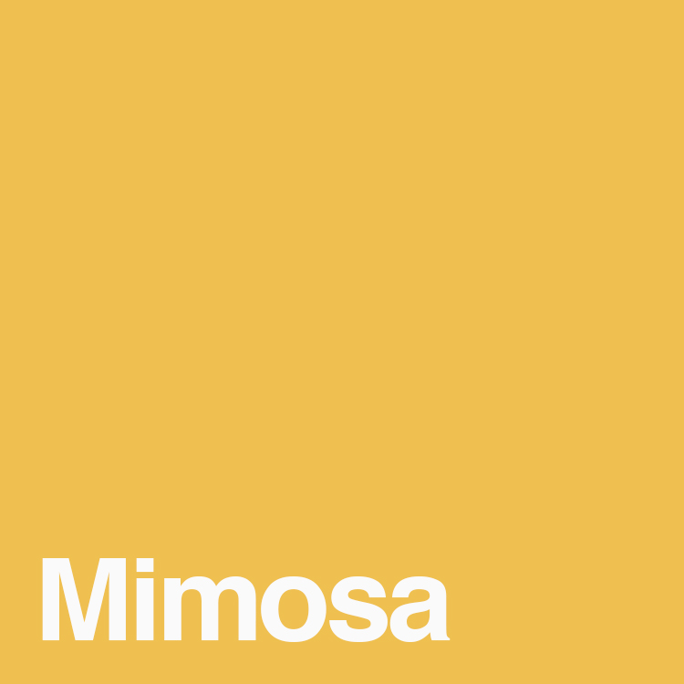
Mimosa
Pantone 14-0848
According to the press release from Pantone, “no other colour expresses reassurance more than yellow”. This sunny yellow gives off the feeling of warmth people were craving in this time of economic uncertainty.
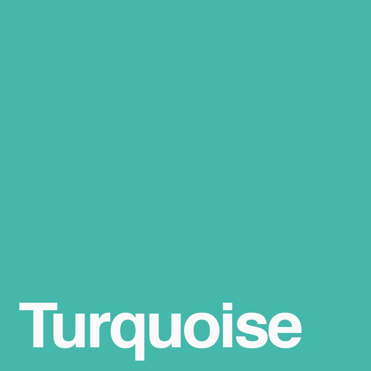
2010
Turquoise
Pantone 15-5519
Similar to Blue Turquoise chosen in 2005, this tropical colour has a little more green in it and radiates the stress-free feeling of a vacation.
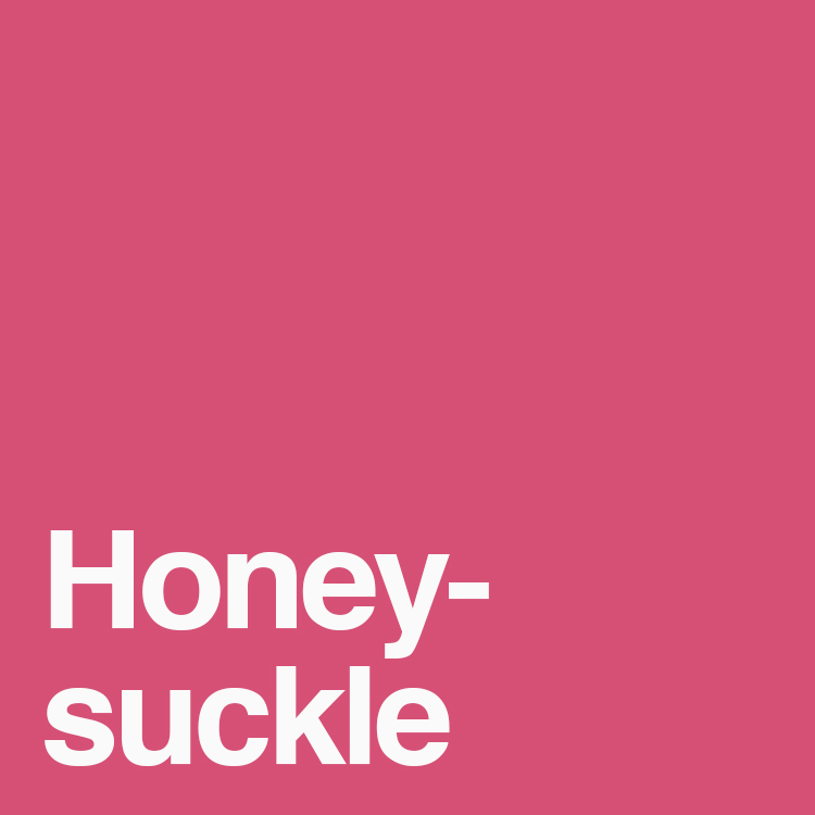
2011
Honeysuckle
Pantone 18-2120
This fun reddish-pink inspired confidence, courage and optimism. Pantone wanted something that would lift peoples’ moods and there’s no denying the fact pink is a happy colour.
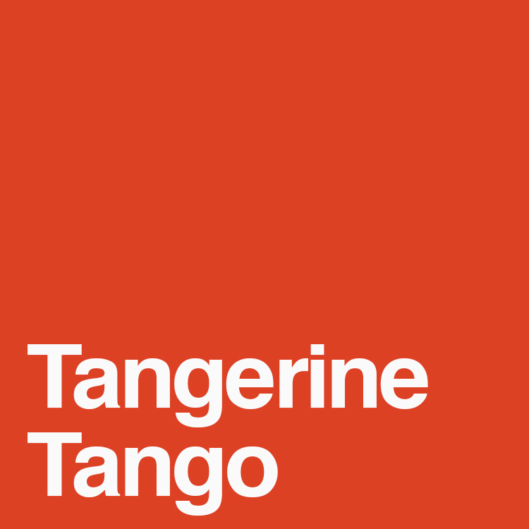
2012
Tangerine Tango
Pantone 17-1463
This energetic orange is dramatic and continues to push in the same direction as the previous colour. Its reddish-orange hue is reminiscent of a vibrant sunset.
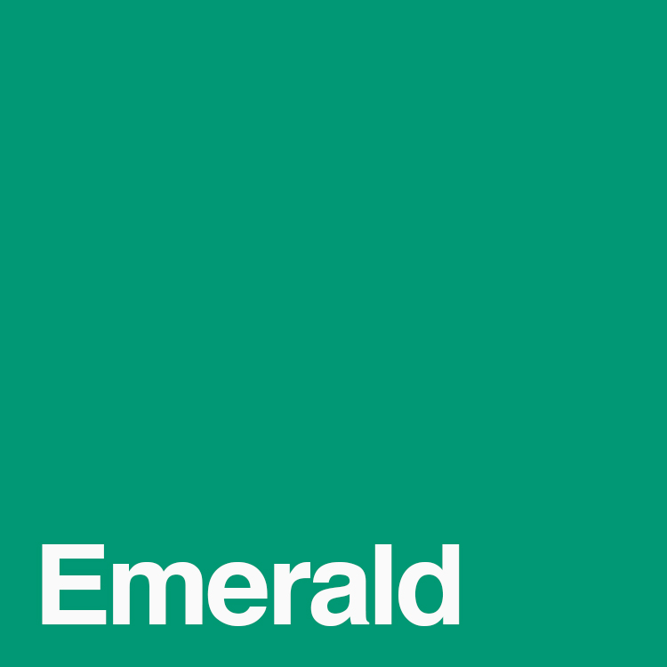
2013
Emerald
Pantone 17-5641
In contrast to the past two warm, vibrant colours is this deep, jewel-like colour that represents growth. This appealing tone was great for both fashion and interior design and has a very elegant feel to it.
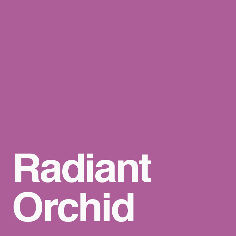
2014
Radiant Orchid
Pantone 18-3224
Sitting on the opposite side of the colour wheel from last year’s colour is Radiant Orchid, a harmony of fuchsia, pink and purple. This captivating colour is meant to spark creativity and expression.
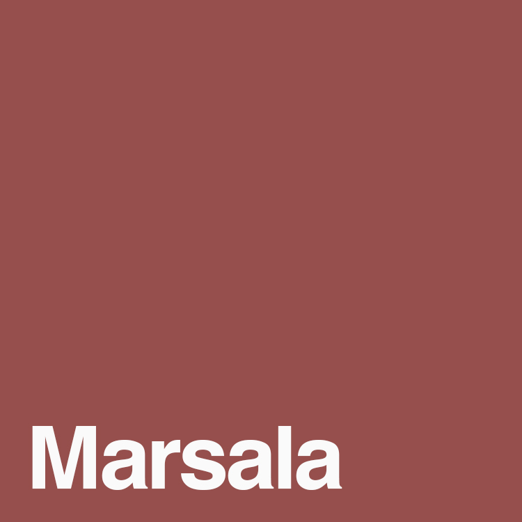
2015
Marsala
Pantone 18-1438
This earthy, dark red-brown is elegant and sophisticated. Much more neutral than previous colours of the year, this year’s colour was easy to incorporate into living spaces because of its versatility.
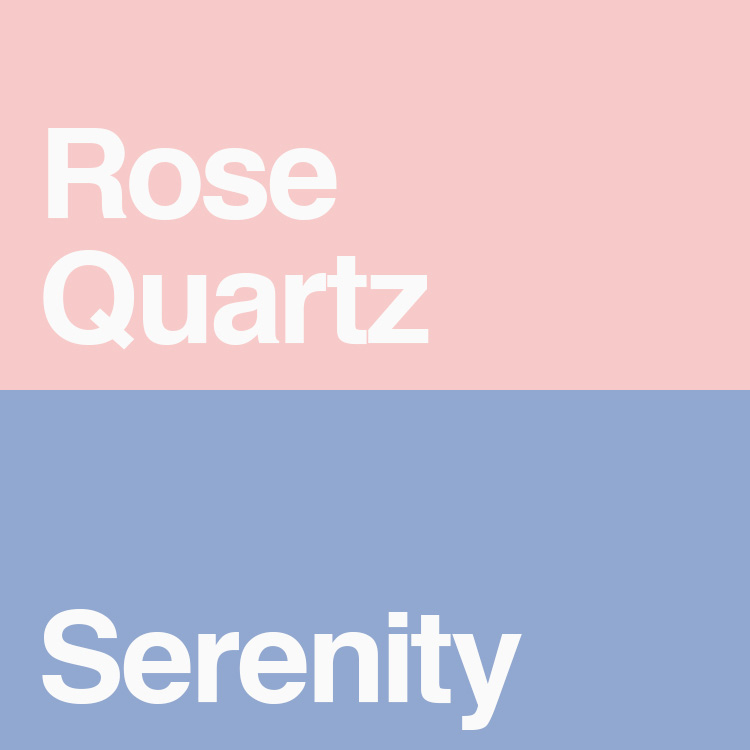
2016
Rose Quartz
Pantone 13-1520
Serenity
Pantone 15-3919
For the first time ever, Pantone selected two shades instead of just one. This colour combination had a peaceful feeling to it and reflected on the fashion world challenging gender and leaning towards gender neutrality.
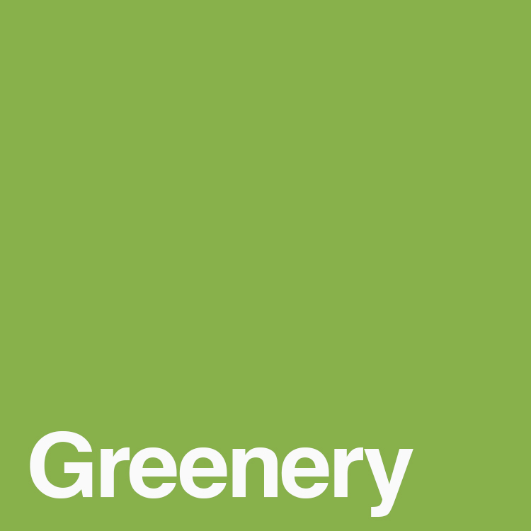
2017
Greenery
Pantone 15-0343
Pantone described Greenery as “nature’s neutral”. Living in such a fast-paced technological world leaves us craving a connection with nature, and with more greenery being incorporated into architecture, home décor and fashion this yellow-green shade was a perfect fit for 2017.
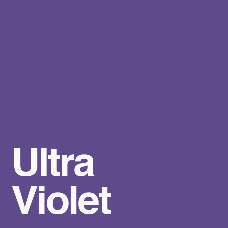
2018
Ultra Violet
Pantone 18-3838
With the trend of everything and anything space related, this mystic purple was brilliantly selected. Its mysterious and imaginative qualities represent “what is yet to come” and is meant to inspire exploration and artistic expression.
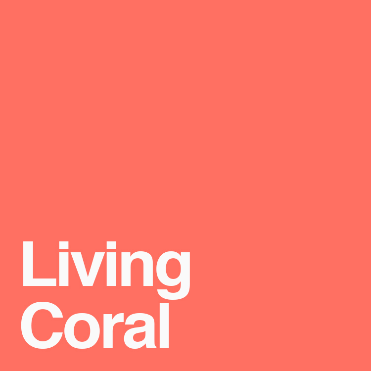
2019
Living Coral
Pantone 16-1546
And finally, this year’s colour. Chosen for reasons similar to Greenery, Pantone described this colour as sociable, spirited and engaging. Living Coral is meant to encourage us to unplug from technology and engage in authentic human interaction.