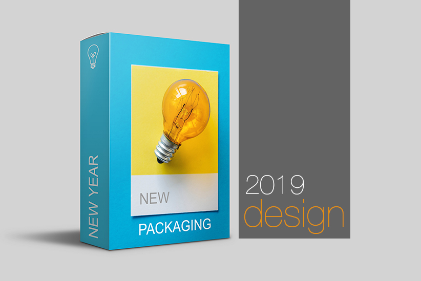
Can you believe it? 2018 is almost behind us. Our team always likes to view the new year as a new opportunity for growth–and our in-house design team is no exception. Source designers are excited for this new year as an excuse to reflect on packaging design trends for the past year and daydream about new and emerging ideas.
Here’s a walk-through on what we’ve observed in 2018 and some predictions for 2019:
2018 was a fantastic year of minimalism and functionality. We foresee the same thing happening in 2019
In the same way that “Clean Labelling” was a desired based on consumer behaviour, their goal seems to push for more transparency from their favourite or new brands. This is why we see minimal packaging design gaining in popularity.
With so much confusing terms and messaging, we noticed many brands are relishing in the joys of simple variation. Basic colours, clean fonts, sensible design and tidy labels will all remain on a packaging designers radar.
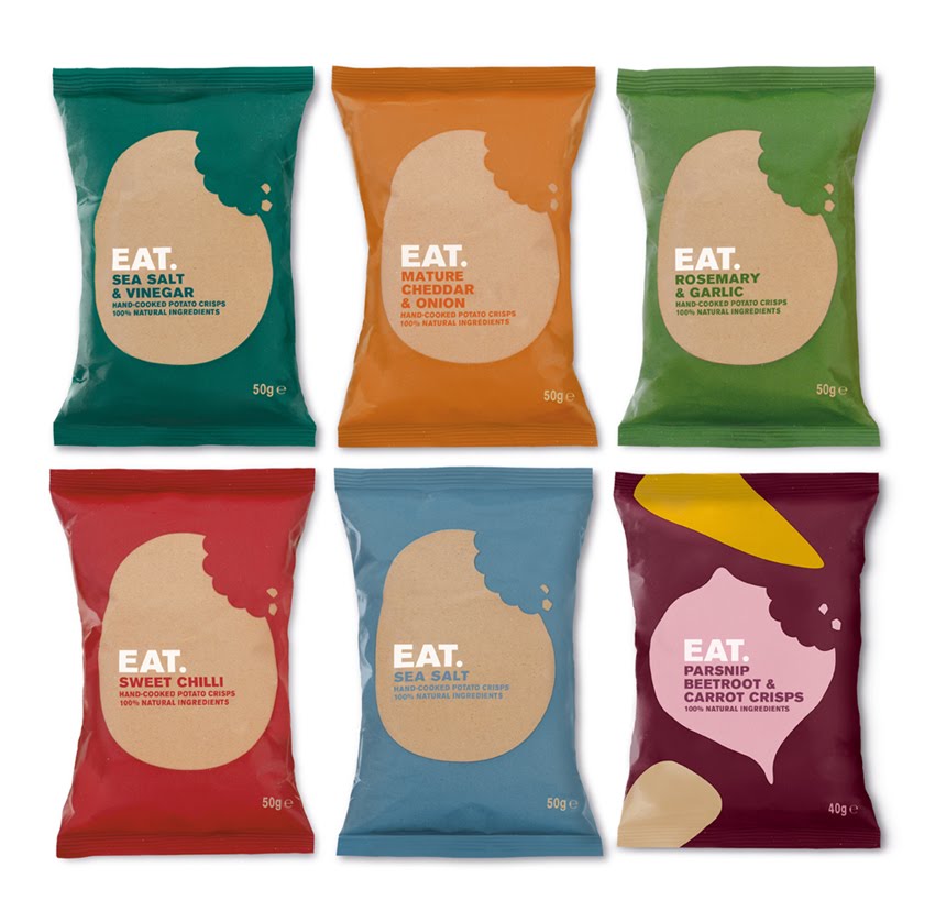
Many successful brands focused on messaging the product unique selling points, and using clear symbols, photography or icons where they can.
At first glance, “keep it simple” seems like an easy way to stay on-trend, but if the messaging is lost, the consumer may have a hard time deciphering the packaging contents, and chances are they’ll completely miss the approach.
Don’t: forget to be clear. Sometimes the design is too cryptic for the consumer to know what they’re spending money on. What is this a bag of? Regulations exist to guide a designer to avoid misleading the audience, but don’t forget to use common sense!
Do: embrace white space. Showing off the product benefits will differentiate the product from others on the shelf. A brand can show-off their taste in design without confusing the consumer of the essential goal and messaging that makes it desirable for purchase.
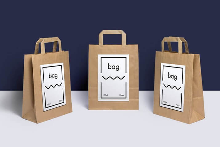
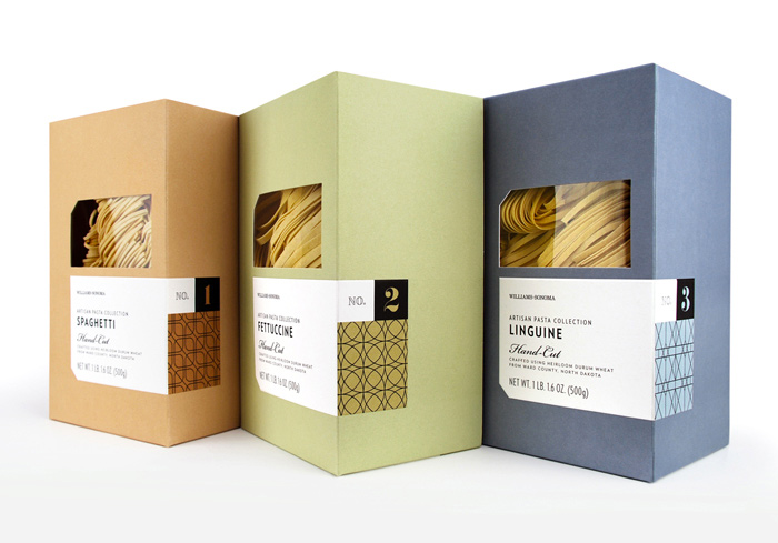
Consumers also seem to be getting smarter! 2018 demonstrated a lot of authenticity in design. We noticed that building trust and stirring up feelings of nostalgia, seems to be moving it’s way into 2019 as well. Is it because of “hipster” consumers? Maybe.
We also see that established brands are noticing consumers realizing the importance of heritage and tradition. It invokes something unique that new products competing cannot achieve.
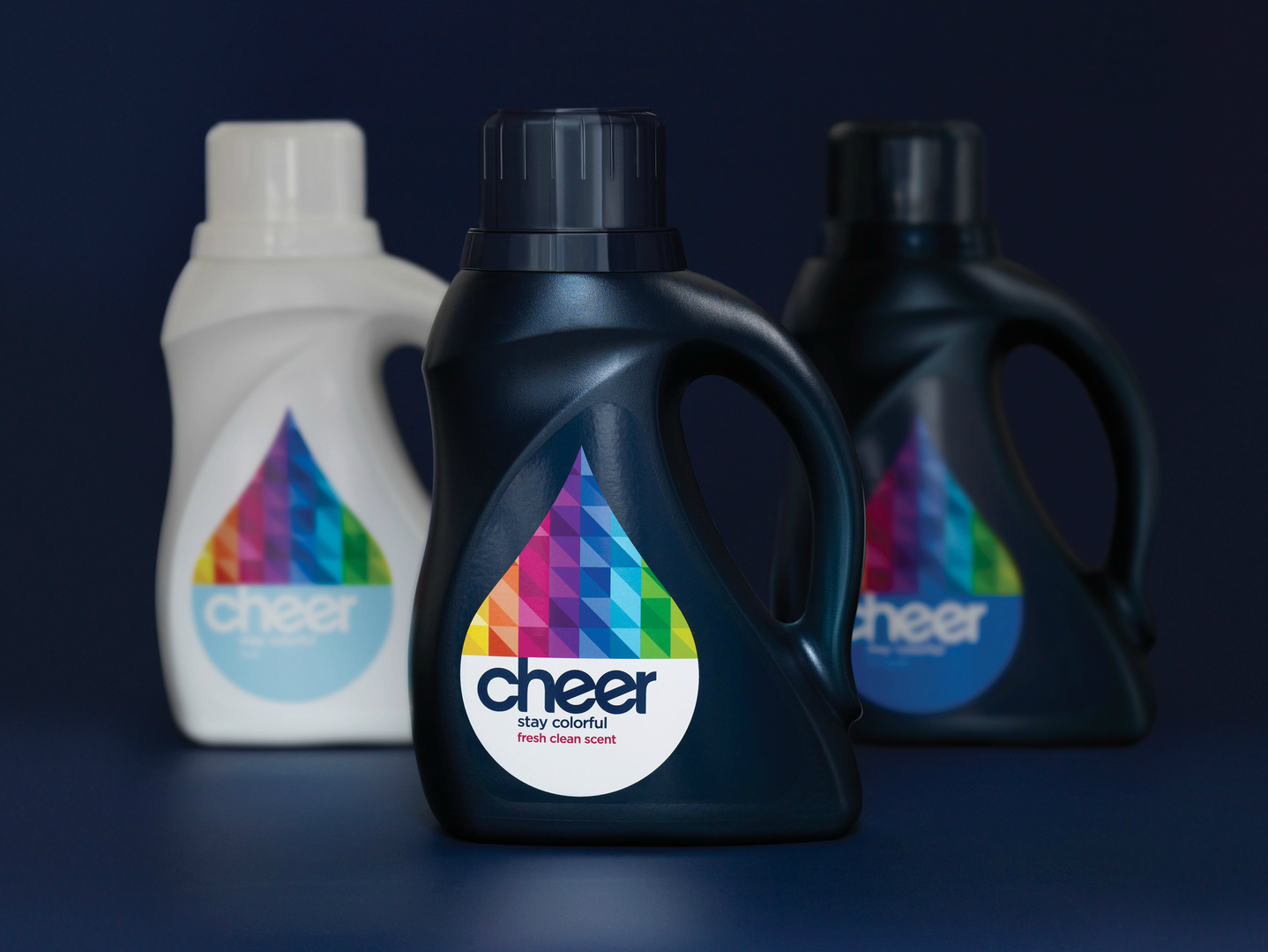


Packaging trends in 2019 will spotlight a brands ability to be direct with the customer, because they are searching for integrity. Large and bold typography cuts through the BS–especially in health-market-sectors–helps achieve uniformity on product shelves. In addition to projecting an image of transparency, it helps the consumer unravel their decision-making process they face when bombarded by competing products on retail shelves.
Todays consumers are eager to really know “whats really inside.” A confident brand is happy and proud to educate and show their consumers that they are the best choice.
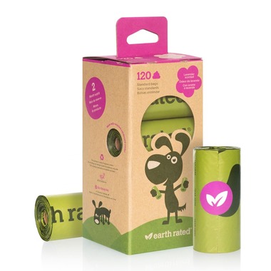
While appreciating functionality: consumers would also like to see this reflected in eco-efficiency. Whether the new packaging is decreasing the thickness of packaging walls with a new material to reduce waste, or the updated packaging uses a new entirely-organic substrate that is compostable, many consumers are willing to pay extra and support a brand that is taking steps to reduce waste. Second-life packaging is also appealing to eco-minded consumers: like a sorbet that is sold in a re-usable glass jar with twisting-lid closure.
We always encourage brands to embrace their own emotions and images. But when faced with something new, ask yourself: What can your packaging include that will allow consumers feel genuinely special, and help influencers to step outside of the retailers shadow?
Unsure if you’re on the right track? Reach out to our in-house design team. Maybe we know exactly how to help!
